Top Story Rancher Addition and Side Rear Extension

Top Story Rancher Addition and Side Rear Extension

A shocking whole house renovation of a top story ranch house addition in South Burnaby

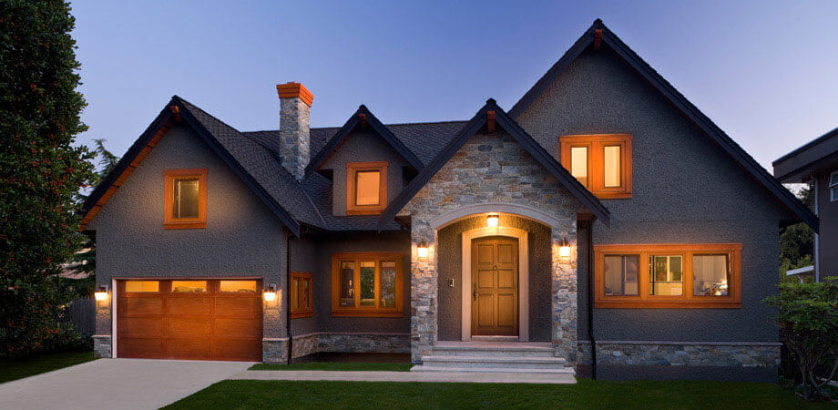
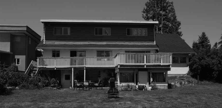
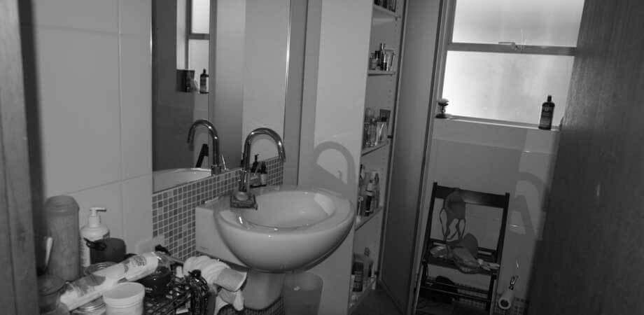
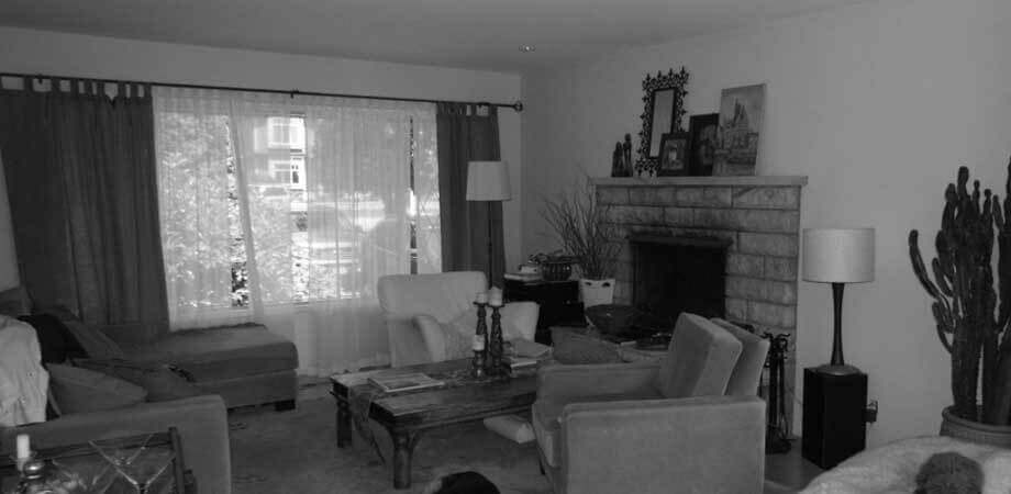
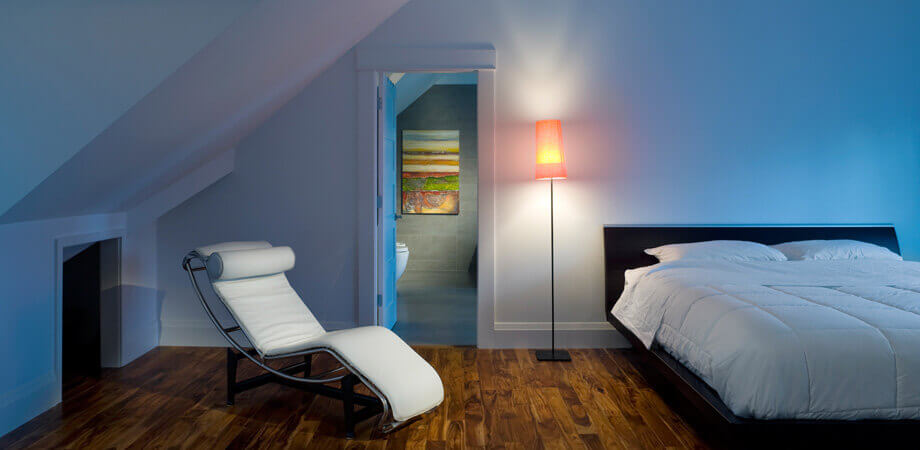
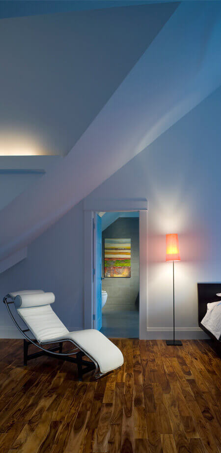
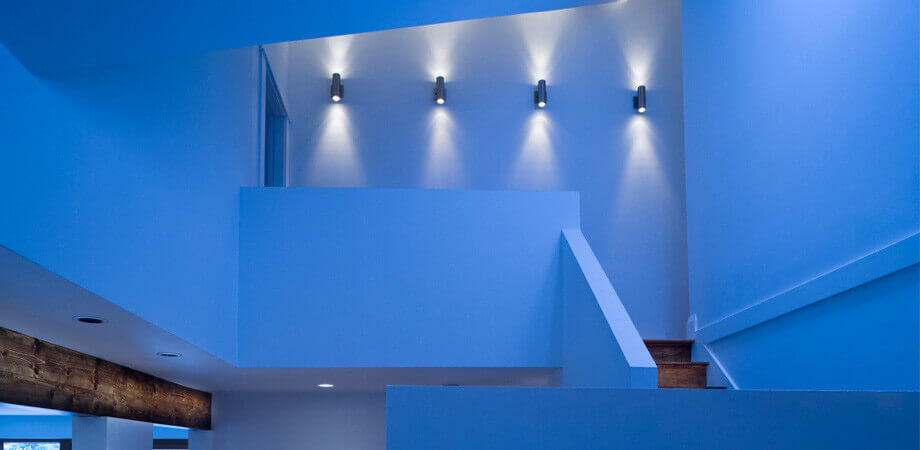
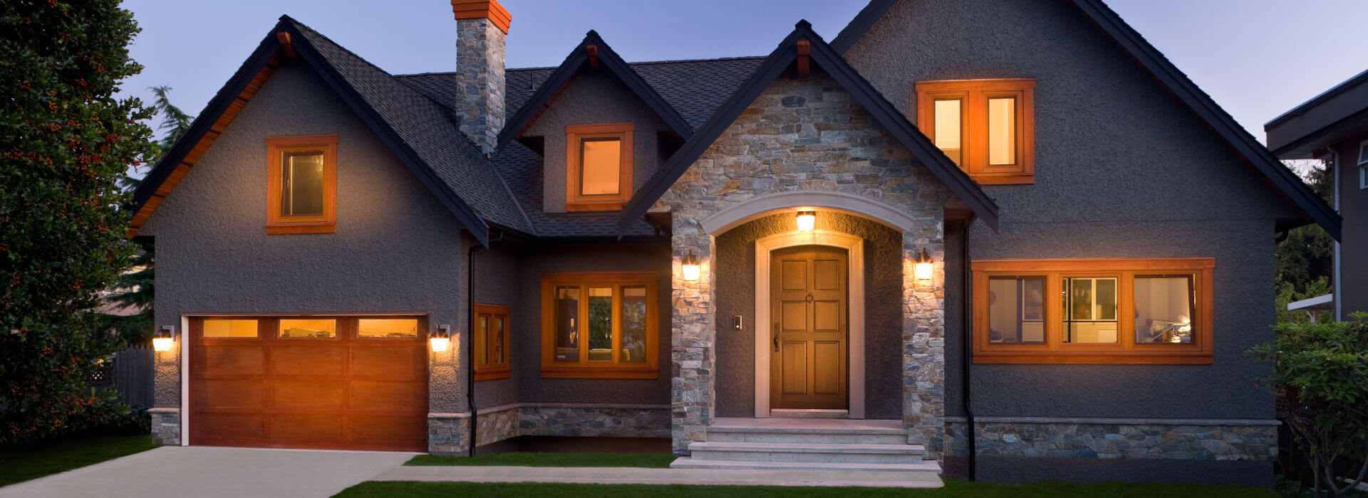
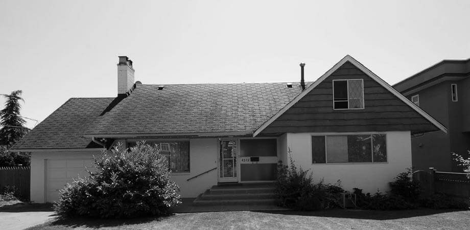
A client wanted to transform an aging, boxy house into a spa-inspired dream home suitable for an active family that loves to entertain. This top story addition was renovated to have a new multi-gabled roofline, ledgestone accents, wood soffits and chimney cap give a contemporary twist to traditional styling found throughout surrounding mature neighbourhood. The owners’ wish for clean lines, demanded exacting framing to produce millwork quality structure. It is an environment of angular rhythm. The unusual vaulted configuration enhances the sense of airy volume. Traffic flow is facilitated for entertaining, and the space layout encourages interaction among guests. The bright task lighting, and the high-contrast backdrops are complimentary.
Location
South Slope, South Burnaby

SCOPE
Top, Side and Rear Home Addition with Vaulted Ceilings

SQFT
4,218

DESIGN STYLES
Traditional, Rustic, West Coast, Northwestern

THE OBJECTIVE

To transform an aging, boxy house into a spa-inspired dream home; suitable for a family with an active entertaining schedule. See the entire construction and progression of this incredible top story addition on our Flickr page!

HOW IT WAS ACHIEVED

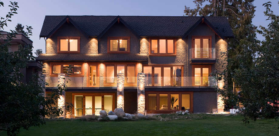
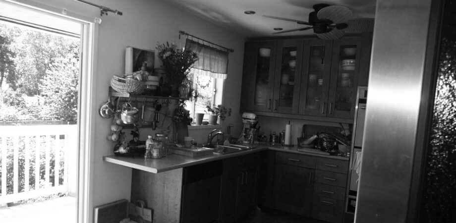
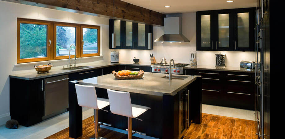
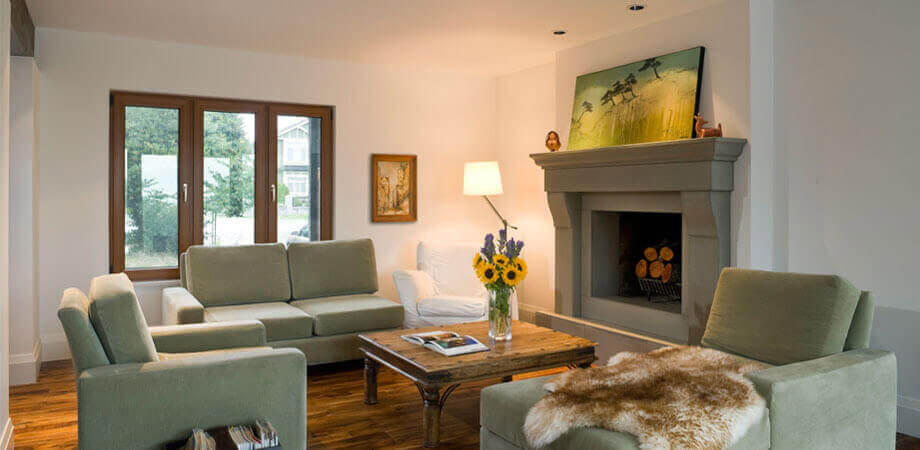
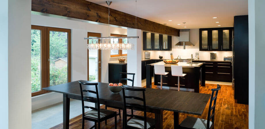
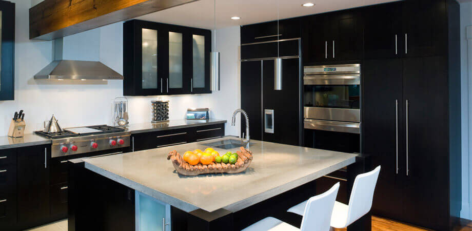
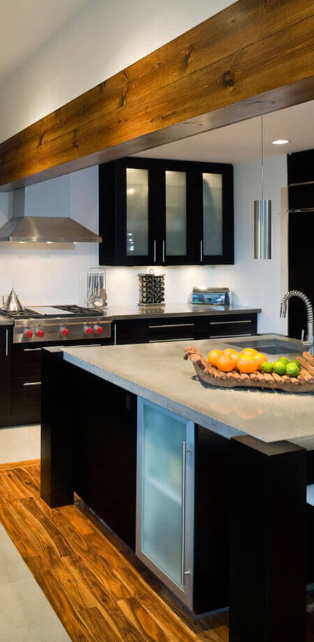
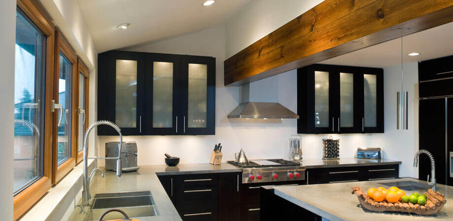
The existing second floor plate was undisturbed while additions were made, requiring flush reinforcing within the main ceilings. Extension over garage created for master suite and gives rear elevation a dramatic symmetry. Second floor substantially removed. Fir-clad, exposed beam, supporting building’s original rear wall, visually lengthens contours of now combined kitchen/dining room while providing rich, textural contrast to the millwork’s smooth, dark-stained finish. A large centre island with prep sink, built-in wine fridge, and casual barstool seating, becomes the room’s working hub; a gathering place for guests and family. New multi-gabled roofline, ledgestone accents, wood soffits and the chimney cap give a contemporary twist to traditional styling found throughout surrounding mature neighbourhood. The interior of the home received a more open dynamic through the removal of partitions and with the traffic flow now enhancing the entertaining spaces. The new layout encourages interaction among guests and provides easy access to the remodeled living room and new patios.

KEY FEATURES

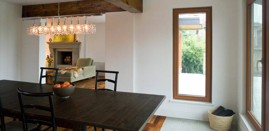
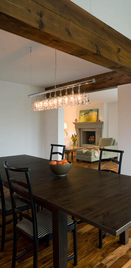
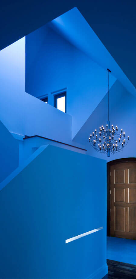
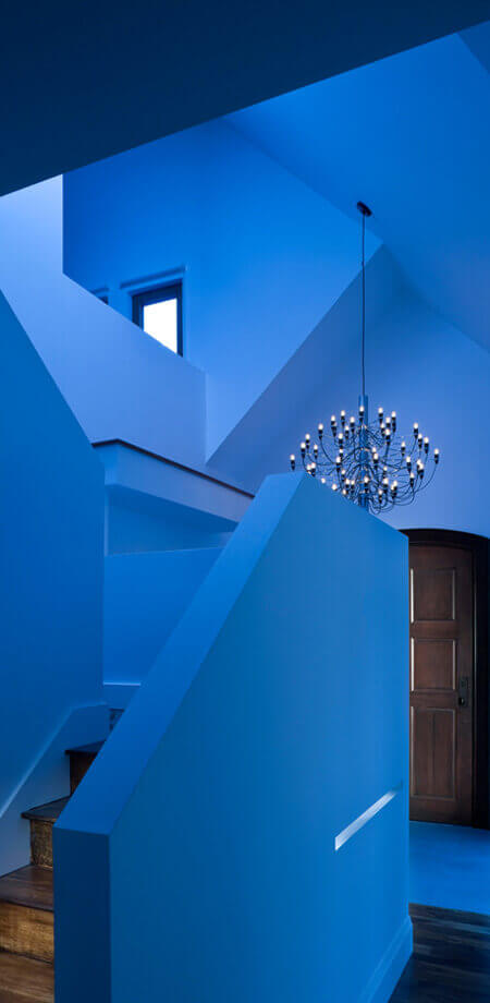
The finished home is a standout on the street with stone and wood accents, secure and efficient tilt-and-turn windows, and a character roofline. The new hand-framed roofline is a celebration of line and space both inside and out. Inside it allowed the ceilings to be vaulted, which is beautifully highlighted in the upper level bedrooms and generous master suite. The dining and living spaces were expanded and refinished which take the expectations for modern living and bring them up a notch to sheer luxury. In addition, the rear of the home features large windows and a deck which provide spectacular views. Modernist bubble-style chandelier adds engaging shadowplay. Two-storey, vaulted foyer walls left unadorned. The myriad interlocking angles and articulations inspire as art.

Project Recognition

CHBA-BC Georgie Award 2009 Winner – Best Residential Renovation $250,000 – $499,999

  • Modernist bubble-style chandelier adds engaging shadowplay.
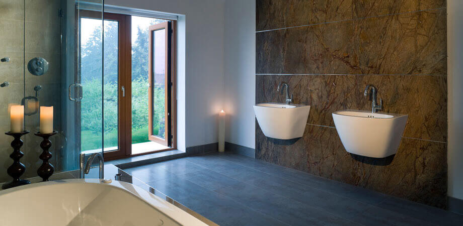
  • Ensuite completed with wall-hung sinks on solid granite feature wall, frameless glass shower, and private balcony.
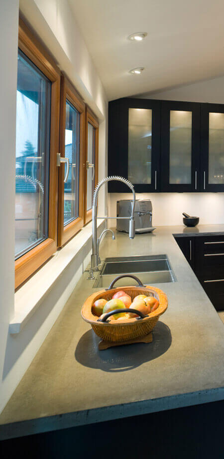
  • High-efficiency tilt-n-turn windows blend pure good looks with superior functions.
  • Forced air, high-efficiency furnace ensures correct airflow despite interior expanse.
  • Icynene foam insulation installed.
  • A crystal chandelier with single rod construction.
  • Master suite continues angular theme with swooping, 3-D ceiling.
  • Large centre island with prep sink, built-in wine fridge, and casual barstool seating, becomes the room’s working hub; a gathering place for guests and family.
  • Fir-clad, exposed beam, supporting building’s original rear wall, visually lengthens contours of now combined kitchen/dining room.
  • Dining area’s linear crystal chandelier blends minimalism with whimsy – its single rod construction echoing the simplicity of cabinetry’s hardware.
  • Forced air, high-efficiency furnace ensures correct airflow despite interior expanse.
  • Orientable ceiling-mount pot lights allow variable lighting scenes to balance task lighting.
  • Countertops are concrete – an eco-friendly, durable alternative that’s carried through to the perimeter flooring and adjoining balcony.