Rustic Modern Condo Update from the Heart
1
This Project Is Recognized Through Industry Awards Programs

2024 FINALIST Georgie Awards
Best Condo Residential Renovation under $250,001-$450,000
Key Features
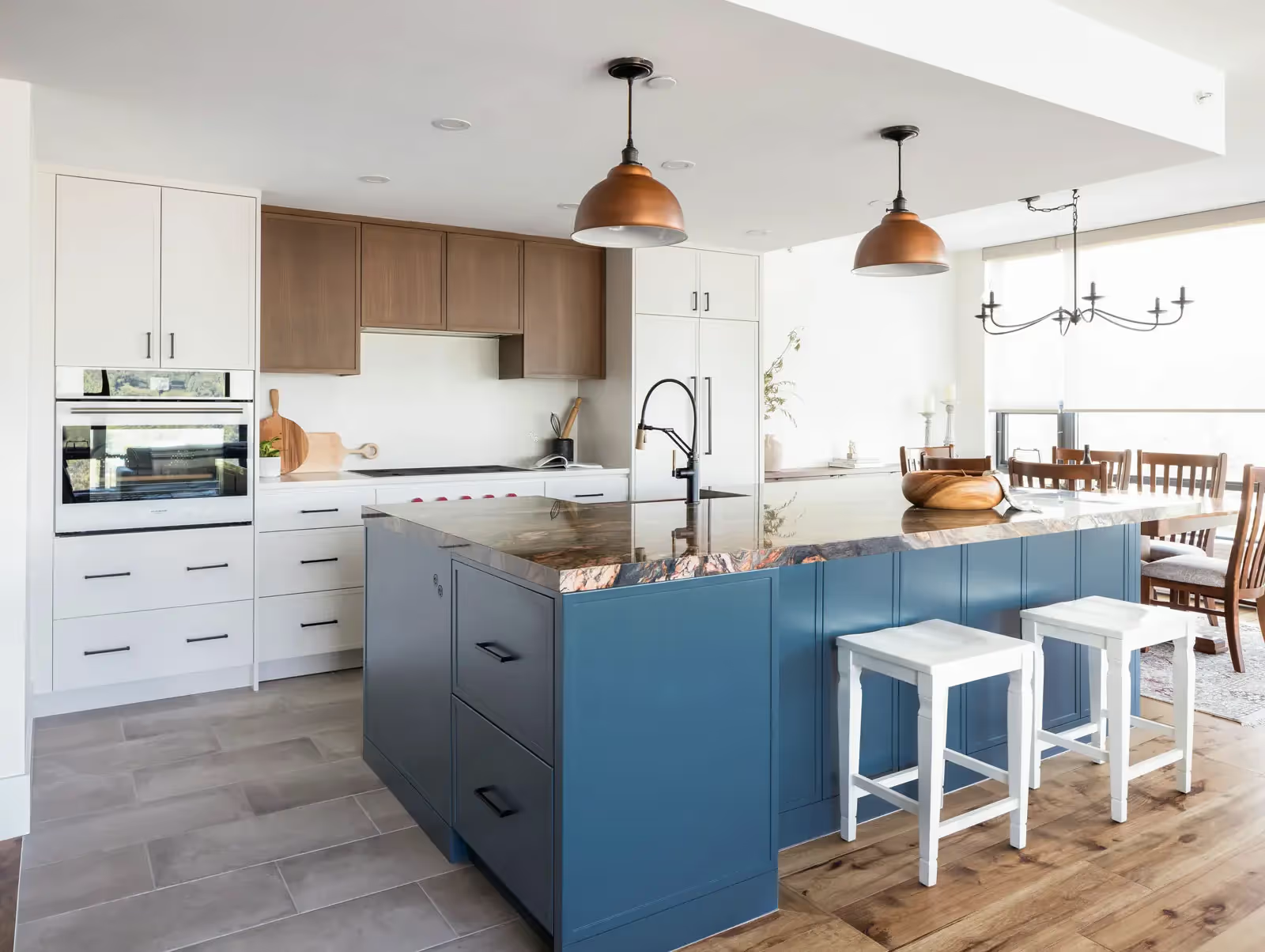
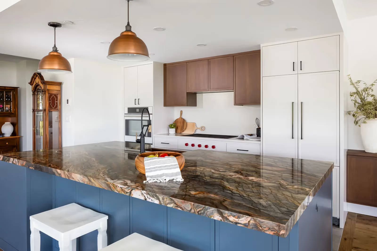
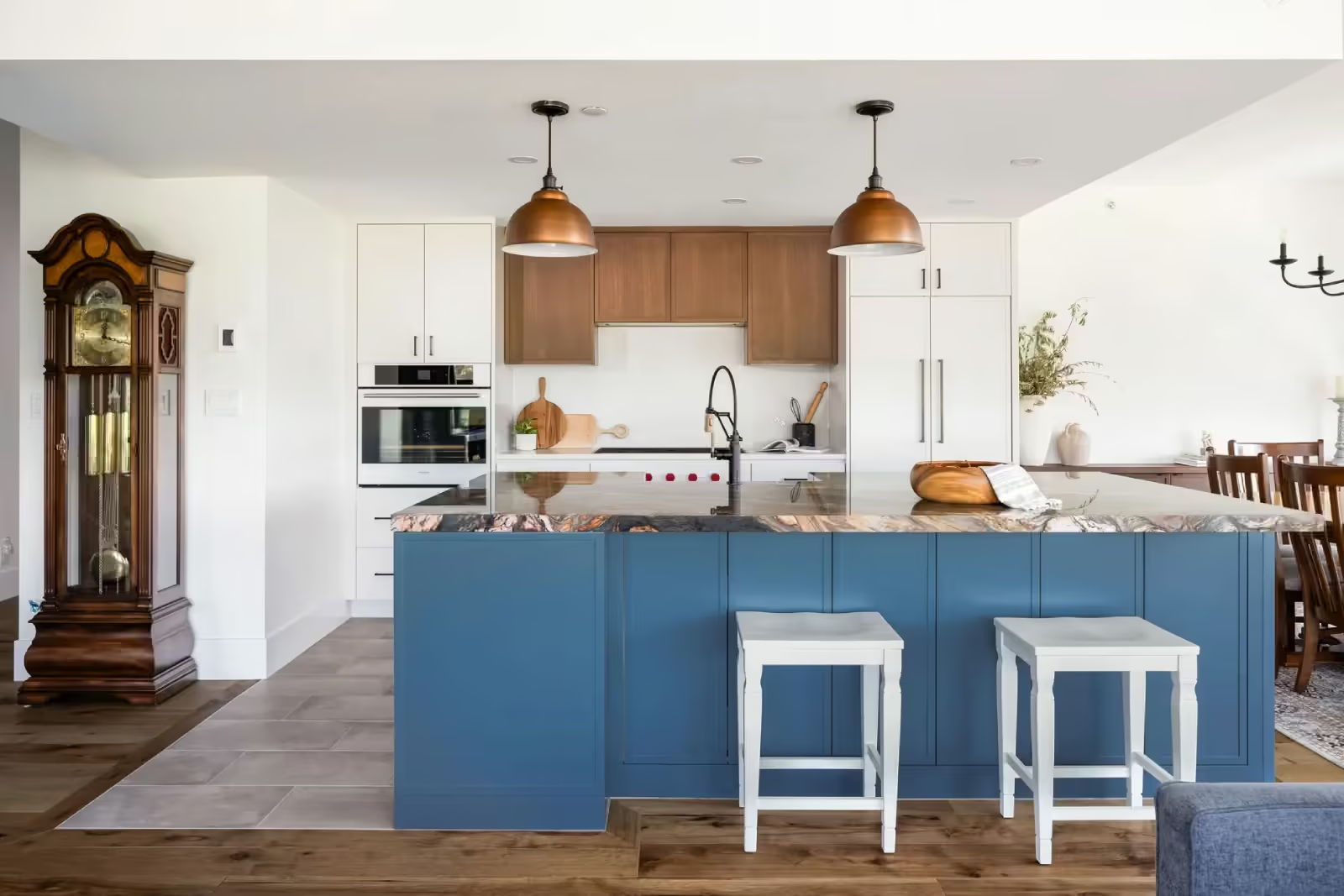
- ‘Fusion Red’ quartzite
- Hammered copper, apron-front sinks
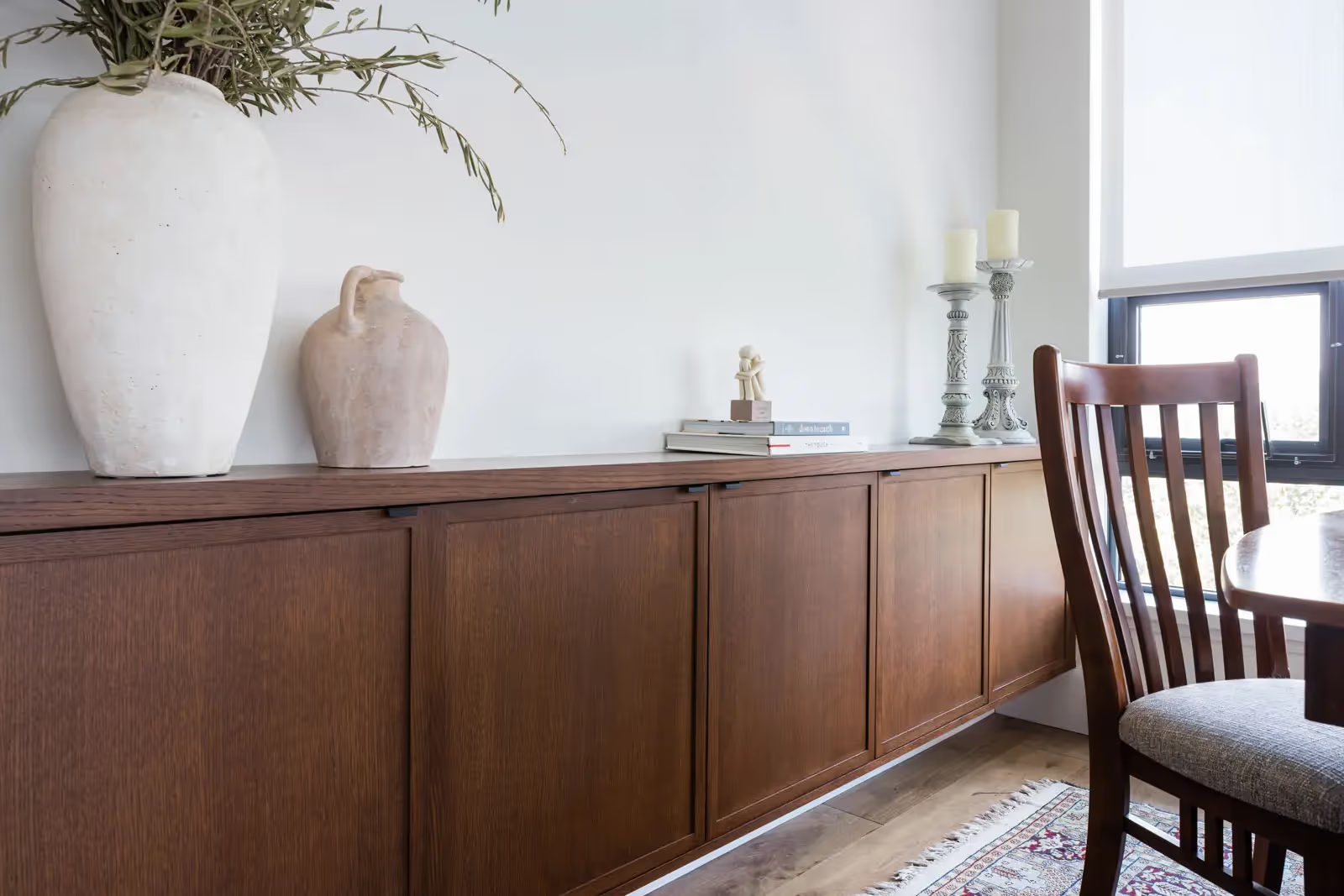
- Rich-toned rift cut oak upper cabinetry
- Hickory engineered hardwood throughout main level
- Classic, soft grey 12-inch-by-24-inch floor tile
- Luxurious Calacatta-marble countertop and floor-tile have gold-veining
- Striking vertical blue/green tiles
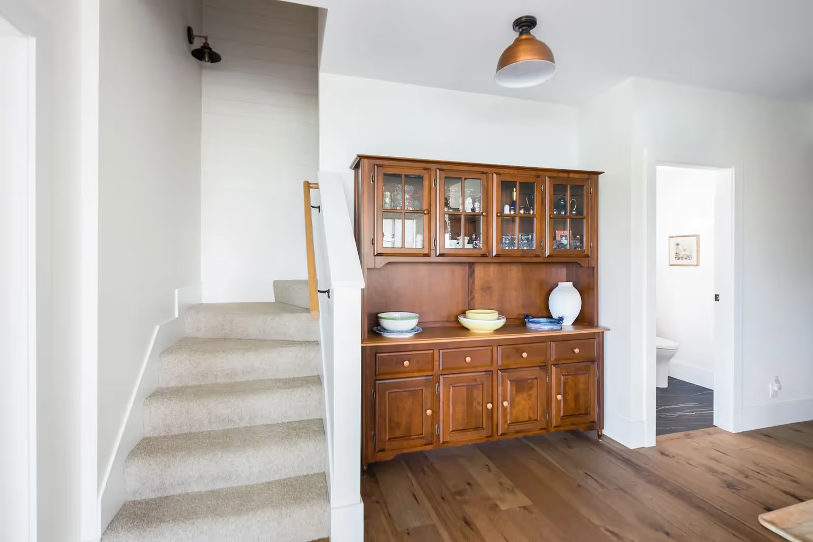
- Shiplap finishing on stairway, repeated on bedroom wall
- In-floor heat
- Upgraded baseboard heater – more energy-efficient, fits under existing sill
- Motorized blinds – low-voltage
- All new light-fixtures, Bocci plugs
- Expanded ceiling drop
THE OBJECTIVE
One of the main objectives of the reno, was to make the living space more efficient, as well as other considerations as the couple ages-in-place. The kitchen should be a feature of the home, and needed to be the showpiece of the project. Without wanting to refurnish the whole home, design concepts needed to consider some existing vintage furniture pieces that would remain, complementing them rather than making them stand out.
HOW IT WAS ACHIEVED
With the kitchen showpiece needing to really pop, a rare-looking natural stone was chosen for the countertop and all decisions revolved around it.
‘Fusion Red’ quartzite was the basis for the entire colour-scheme. A challenge of the condo is how the slab couldn’t be craned in, and needed to be installed in two pieces, with a seamless join.
The inclusion of warm-whites and soft greys, a rustic modern look, hammered copper sinks and carefully curated faucets, handles and hardware, as well as gold-veined marble tiling, helped connect the older furniture pieces, with a clean, more modern look.
Removal of the dividing wall to the dining area extended the kitchen and allowed room for a deeper island and better pathing.
Homeowners accumulated multiple small appliances that were previously stored in the front-closet and wanted these appliances incorporated into the kitchen. The island was designed with full storage on both-sides to hold all their favourite small appliances right at their fingertips – and now with microwave-drawer, pullout-fridge/freezer and dishwasher.

2
What Clients Say About Their Home Renovation Experience in Vancouver
Clients who worked with TQ Construction often share how smooth the process felt and how well every detail came together. Each renovation is handled with care, clarity, and a focus on real results, creating homes that look great, feel balanced, and work better every day.
“They are professional, organized, responsible and trustworthy. The crew is skilled, friendly, helpful and attentive – fabulous!”
Martha H.
North Vancouver
“Communication, transparency, and follow through are superb... Working with TQ has felt more like entering a project with a partner rather than an adversary.”
Jon A.
Vancouver
4.7 Star Rating
500+
Projects Completed
“Their expertise and experience are key factors... workmanship is outstanding... team is professional, well organized and clearly communicate.”
Irene H.
North Vancouver
“I would not hesitate to recommend TQ Construction to anyone contemplating renovations.”
Mike J.
Vancouver
Let’s get started
Get a Consultation for Your Home Project
Thinking about a home renovation or new build in Vancouver? Tell us a few details, and our team will send you a free consultation. TQ Construction makes it easy to plan your budget before you start.
Give us a call
604.430.9900Send us an email
info@tqconstruction.ca

