From Cut-off Condo Kitchen to Culinary Hub

From Cut-off Condo Kitchen to Culinary Hub

If a kitchen is the heart of a home, then the condo featured in this design story was cut off from its heart.

If a kitchen is the heart of a home, then the condo featured in this design story was cut off from its heart. The condo’s owner was looking forward to spending his well-earned leisure time entertaining, but his disconnected and cramped kitchen didn’t lend itself to the social gatherings he envisioned. He asked TQ Construction to create a living space that connected the living area, dining area—and most importantly for this foodie homeowner—the kitchen.

While creating a new social hub for their client, the design team found that the space presented some challenges. Because there were some structural aspects of the condo that couldn’t be modified, they had the task of working with tight spaces and making them feel open. The design, overall, is simultaneously cohesive and dynamic, and the space is remarkably functional and efficient, as a recent dinner for ten at the condo, which went off without a hitch, confirms.
Featured In

Broughton Park Condo

Location
West End Vancouver

SCOPE
2 Storey Condo Makeover, Masterbath Reconfiguration, New Open Concept Kitchen-Living-Dining

SQFT
450 SF UL , 850 SF LL, 64 SF Original Kitchen, 135 SF Proposed Kitchen

DESIGN STYLES
Industrial, Bauhaus, Modern, Coastal

THE OBJECTIVE

To reconfigure the master-bath and reclaim space from the lower level second bedroom, creating an open concept kitchen-living-dining area for the client; a foodie enthusiast.

HOW IT WAS ACHIEVED

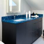
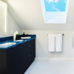
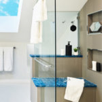
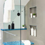
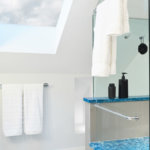
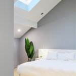
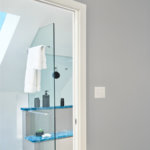
Gone are the walls that enclosed the kitchen and the fireplace that bisected the living and dining areas. In their place is a new, open space in which the host can mingle easily with guests and a built-in buffet-bar containing a wine fridge, accessory drawers and floating display-shelves. We opened up the master-suite making the most of the existing skylights. To maximize a small, dark space, the newly reconfigured floorplan now features an extended vanity, a niche wall nook for storage, shower bench, a back lit LED medicine cabinet and a lighter color pallet.

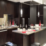
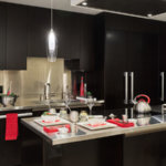
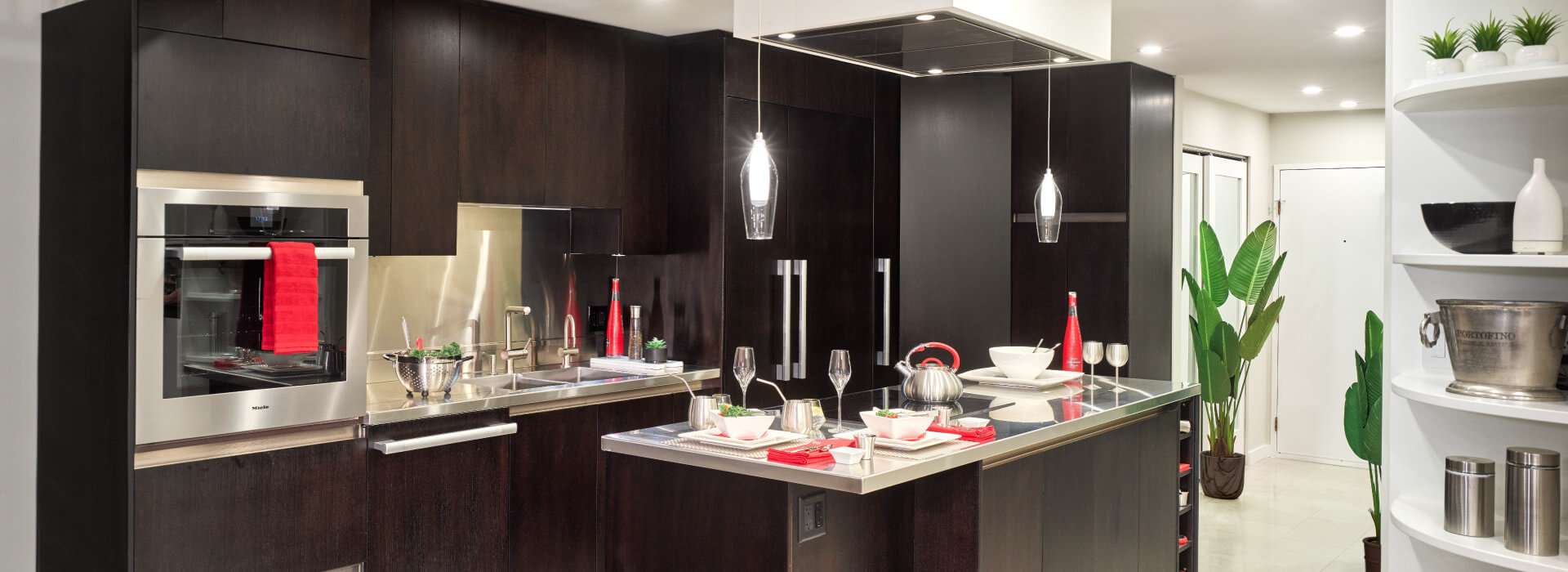
Because of an existing structure, we couldn’t have a hood fan completely recessed into the ceiling above, so we built it into a dropped box that blends into the ceiling, making it less noticeable while still maintaining the unobstructed views to the dining area. The 13-foot stainless-steel island countertop was too large for the elevators, so it was lifted by crane up and through the balcony into the client’s fourth-floor penthouse.

The result justifies any challenge faced along the way: gone are the walls that enclosed the kitchen and the fireplace that bisected the living and dining areas. In their place is a new, open space in which the host can mingle easily with his guests while adding the finishing touches to a gourmet meal. At the same time, company can avoid encroaching on the chef’s workspace by helping themselves from the built-in buffet-bar, which contains a wine fridge, accessory drawers, and two floating display-shelves.

KEY FEATURES

The kitchen’s cabinets are finished in a dark espresso stain, and dramatic, dark-stained walnut tones throughout the space—in five-inch wide-plank bamboo flooring, the backside finish of the eating bar, and on the barstools—add continuity, enhancing the sense of spaciousness.

These dark tones are contrasted with the dining area’s white cabinets and the kitchen and foyer’s light-coloured limestone, creating visual interest. To achieve the sleek-with-industrial-undertones look the client requested, the designer did away with protruding cabinet hardware by choosing clean-looking C and L channel recessed pulls, and opted for stainless-steel countertops, backsplash, and integrated sinks to lend the space an industrial edge.